Rebranding IncaFé: How it started and where we are today
Posted by Joseph Verbeek on
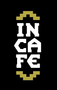
We spent a lot of time on the original branding of the business in 2006. That was a great process and we came up with artful designs. We even created our own font. We had lots of people giving us feedback and they all loved it! However, everyone had some knowledge of who we are and what we are doing so they understood it, but the artwork we came up with for our coffee bags and other marketing material did not exude “coffee” and “organic” for total strangers.
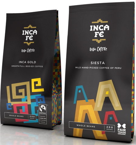 One of the challenges we had was our name. Very few people pronounce it the way we intended: the Spanish way with effectively one accent on the ά and one on the é since there are 2 Spanish words connected. No accent on the i!
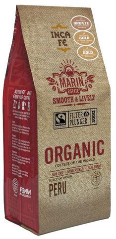 In 2013 we had enough of the silly catch phrases people have with their brand and we dropped the “love.coffee”. We also dropped the black background as it was very limiting. We changed our packaging from a black background. More and more we had to work with lighter backgrounds and we changed often the colour of the words INCA and FE in the logo. The gold bars always remained gold.
In 2019 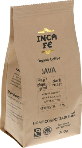 we changed to the logo that we have been using till now. Our packaging and most backgrounds became a kraft paper.
The gold became more gold as we used a different technique when printing. We added permanently the words Organic Coffee under the logo to emphasise our purpose and specialty.
We are proud to be one of only a handful of companies in NZ that only manufactures certified organic products.
The gold bars remain and are better than ever on our new packaging! We hope you will love our new look as much as we do.

